Anthony the Chef's Recipe Website
.
The brief for this website was to create a place for a popular food blogger and Red Seal Chef, Anthony, to receive recipe submissions from his readers and reshare them in a way that would make them easily retrievable by different search criteria. In order to create content on his blog—and because he was already receiving a number of recipes emailed from readers each week—Chef Anthony came up with the idea of inviting people to submit their favourite recipes for him to cook and write about, including their ingredient lists and Anthony's updated instructions for home cooks. If possible, he also hoped to find and put forward ways of opening new revenue streams so that he could continue to provide regular content updates.
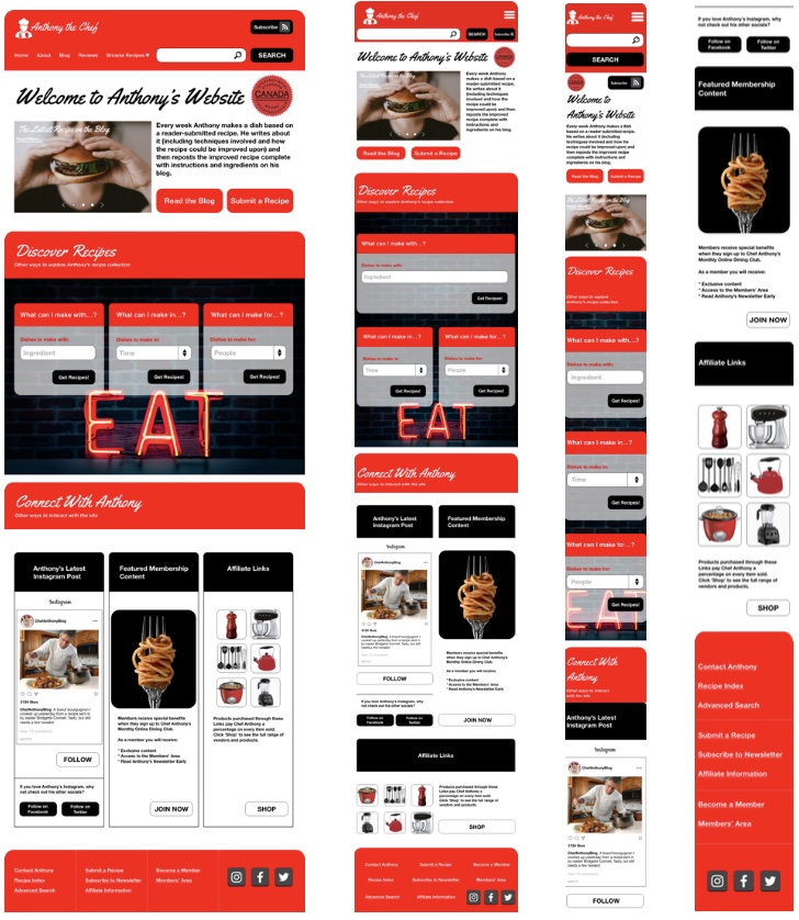
The requirements for presenting his content were otherwise fairly open, so the first step to designing a landing page was to create a wireframe prototype to test with a small group of home chefs in order to find out what potential features resonated with them as the main audience for the site. Anthony found that the majority of his submissions came from women in their 30s who had fulltime careers and children, so I sourced three test participants who roughly fit this profile to click through the prototype as though searching for a recipe to prepare for a weeknight dinner.
The testing process revealed that ingredient availability, portion quantities, preparation and cooking times were these users' key concerns, therefore it made sense to make them into the main search filters for calling up recipes from Anthony's blog archives. It was also important to make connecting with Anthony as easy as possible, which I accomplished by providing a clear call to action button for users to share recipes, and multiple options for engaging with his personal content and branding. I suggested the inclusion of affiliate links so that users could purchase items used by Anthony in cooking the recipes as an easy option for increasing the blog's financial viability.
The colour palette and design elements for the blog were inspired by the concept of an "open all hours" short order diner, with a bright "open sign" red and neon sign visual elements emphasizing that users could come to the blog at any time and find something to prepare and eat quickly. The high fidelity prototype was also designed to be responsive, with mobile, tablet, and desktop views represented.